See the Tabbed Pages for links to video tutorials, and a linked list of post titles grouped by topic.

This blog is expressly directed to readers who do not have strong training or backgrounds in science, with the intent of helping them grasp the underpinnings of this important issue. I'm going to present an ongoing series of posts that will develop various aspects of the science of global warming, its causes and possible methods for minimizing its advance and overcoming at least partially its detrimental effects.

Each post will begin with a capsule summary. It will then proceed with captioned sections to amplify and justify the statements and conclusions of the summary. I'll present images and tables where helpful to develop a point, since "a picture is worth a thousand words".

Showing posts with label global temperature. Show all posts

Thursday, October 7, 2021

What, Again? Global Warming Continues Unabated

Summary: This series of posts tabulates important findings from the six Assessment Reports (ARs) that the United Nations Intergovernmental Panel on Climate Change (IPCC) has released since 1990.  The previous post, “What, Again? Greenhouse Gases Accumulate in the Atmosphere", summarizing the six ARs, presents past greenhouse gas (GHG) emission rates, discusses future emission scenarios and proposes principles to minimize further emissions to keep accumulated GHG levels to as low a level as possible.

This post presents the direct consequences of rising GHG emissions: the increase in global average temperatures and its consequences, as foreseen in differing emission scenarios over the three decades that ARs have been issued.  Extreme weather and climate leads to significant economic and social harms and damages.  A final post will deal specifically with the effects of warming on our water environment: extremes of precipitation or its failure, melting ice domains and rising seas.

Some may feel this series repeats refrains, looping like broken records; such people may suffer from “climate fatigue”.  Humanity, however, has not responded to the worsening climate documented in the AR series. The critical, dire climate projections summarized in these posts should provide powerful incentives to take meaningful action at this time.

      *         *         *         *     *

The United Nations Intergovernmental Panel on Climate Change (IPCC) released the first of three volumes of its Sixth Assessment Report (AR6) in August 2021.  ARs have been issued at intervals of 6-7 years since 1990. They document the history of the annual rate of global emissions of the principal GHGs, arising from human activity, and of the total amount of GHGs accumulated in the atmosphere since the industrial revolution (Ind. Rev.) began.  Using climate models and a range of scenarios of GHG emission rates they present projections for each scenario of future climate characteristics and effects to the end of this century.  They also discuss general goals (but not specific policies) for limiting future emission rates.

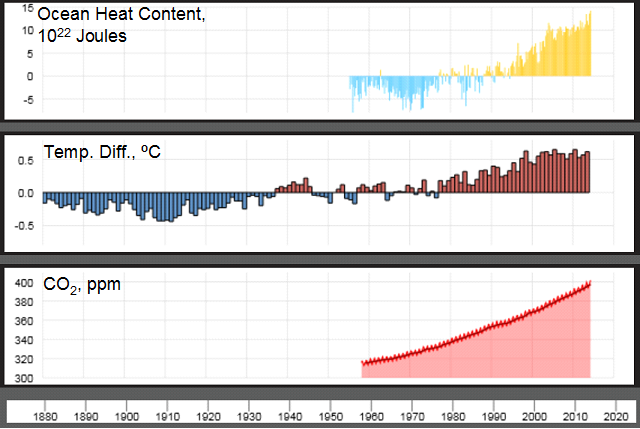
The results and projections presented in ARs 1-6 are broadly consistent with each other across the AR series, but have greater specificity and stronger assessments of likelihood as the series progresses.  They record the profound increase, due to human activity, of accumulated atmospheric GHGs, especially carbon dioxide (CO2), across the years.  Most GHGs do not dissipate in the atmosphere; they continue accumulating to higher levels as long as their annual emission rates continue.  It’s as if a tub fills higher and higher with water (representing GHGs), as long as the faucet is open.  When the emissions (the faucet) are turned off, the level in the tub doesn’t get lower; the water/GHG content stays at the level accumulated up to that time.  Being greenhouse gases, they retain more and more heat as their level increases.  The result is that global average temperatures continue rising, causing damaging extreme events the world over.

The graphic below shows the coupled relationship between atmospheric CO2 levels from 1880 to 2019 and corresponding yearly global average temperatures.  The correlation


Overlaid graphs of atmospheric CO2 concentration in parts per million (ppm; orange line, orange numerical scale on the right vertical axis) and yearly values of the global average temperature in °C (white line, white numerical scale on the left vertical axis; for corresponding °F multiply by x1.8).  Temperature values shown are the deviations from the 30-year average temperature from 1881-1910. Source: Climate Central https://www.climatecentral.org/ using data from the National Aeronautics and Space Administration Goddard Institute for Space Studies (NASA GISS), National Oceanic and Atmospheric Administration National Centers for  Environmental Information (NOAA NCEI), and NOAA Earth System Research Laboratories (ESRL).


is remarkable.  Elsewhere in the ARs (but not included in this series of posts) the IPCC has shown that it is only due to the CO2 and other GHGs that have been added to the Earth system from human actions that the global temperature has risen as shown in the graphic, and not because of any other potential factor. 

The topics selected for this post, tabulated below in the Details section, are Past Temperature Rise, Projected Further Rise in Global Average Temperature, and Projected Warming Patterns.  As seen in the table, the authors of AR1 recognized already in 1990 that because of the accumulation GHGs the Earth system was warming (Column 2).  The global average temperature has continued rising, by 2021 (AR6) reaching 1.07°C (2.06°F) above the 1850-1900 average value, early in the Ind. Rev.

In future decades the temperature is projected to continue increasing (Column 3), depending on the emission scenario, from stringent to relaxed annual emission rates.  In AR6, compared to 1850-1900 (early in the Ind. Rev.), stringent emission scenarios project 1.0-1.8°C (1.8-3.2°F) warming by 2100, whereas the relaxed scenario projects 3.3-5.7°C (5.9-10.3°F) warming. Finally, the need to reduce annual emissions was recognized beginning with AR1 and reiterated, with increasing urgency, throughout the series. Current goals are to keep warming to 1.5°C (2.7°F; optimal) or 2°C (3.6°F; acceptable) above pre-industrial values (AR6). Higher global temperatures are projected (Column 4) to lead to extreme weather and climate events, many of which we are already experiencing around the globe.

Whereas the need to reduce emissions is expressed in AR1 and extends up to the present in AR6, the strength of climate science underpinning those conclusions has increased dramatically over time.  The capabilities of gathering data and using more powerful computers to analyze them, and to develop more refined, detailed climate models have all increased dramatically.  (Incidentally the Nobel Prize in Physics, awarded October 5, 2021, recognized the development of early climate models.  These have served as the foundation for today’s highly refined models.)

Recent ARs reflect this enhancement.  For example the current first volume of AR6 was compiled by 234 climate scientists chosen from among all the nations of the IPCC.  They reviewed over 14,000 research articles published since AR5.  Drafts of the chapters in AR6 were reviewed by other scientists as well as by national governments.  We can feel assured that the final text represents scientific and political consensus views.

Conclusion

In the table shown in the Details section Column 4, “Projected Warming Patterns”, summarizes the increasing urgency of acting to reduce annual emission rates to near zero as the AR series progresses.  AR2 as long ago as 1995 foresaw some regions of the Earth having more severe floods or droughts while others would be less affected.  There would be more extremely hot days and fewer extremely cold days. The forecasts in AR4 in 2007 are made with higher confidence than in AR3.   AR6 in 2021 foresees continued warming with worse hot extremes and droughts in some areas.

Indeed, actual extreme weather and climate events have become the subjects of frequent current headlines, documenting heat waves and droughts, famine, uncontrolled wildfires, intense precipitation events and flooding, and melting of glaciers and ice sheets leading to sea level rise, documenting effects that were only predicted in the early ARs.  Also, by AR6 the science of attribution of extreme climate events has progressed dramatically, and permits ascribing the severity, if not the actual occurrence or not, of events to the effects of global warming.

Early action could have been taken at moderate levels of effort and expense to avert future, if not yet apparent, hazards such as described in Columns 3 and 4 of the table.  Such opportunities were not seized.  By 2021 such hazardous events are now current, requiring immediate action.  Necessarily these current actions must be far more aggressive, pervasive and costly in order to deal with a warming Earth approaching criticality.  They also require fundamental and comprehensive changes in social and cultural approaches to adapt to the consequences of warming.

Unequivocally we must encourage our political, corporate and civic leaders to embark on bold, comprehensive actions without further delay.

Details

This writer collated the entries in the following table from either the Summary for Policymakers, a “Headline” document or a press release, all issued by the IPCC in conjunction with each AR.  The entries are necessarily selective rather than comprehensive, and have been edited for brevity.

EVALUATIONS OF GLOBAL WARMING AND TEMPERATURE IN IPCC ASSESSMENT REPORTS


© 2021 Henry Auer

Monday, January 19, 2015

2014 Was the Warmest Year Globally Ever Recorded

2014 had the highest global average temperature ever recorded.  The U. S. National Oceanic and Atmospheric Administration (NOAA)  and National Aeronautics and Space Administration (NASA ) jointly announced on Jan. 16, 2015 that the year 2014 was the hottest year since record keeping began in 1880.  This result represents the globally averaged temperature, for both land and ocean surfaces, over the entire year. 

A 1½ minute video from NASA gives more information on this finding.  It includes a speedy review, year-by-year and location-by-location across a map of the globe, of how annual average temperatures, in ºC (multiply by 1.8 for ºF), have increased from 1957 to 2014.  (They are shown as the differences from a 30-year reference period from about 1945 to about 1975).
The ten hottest years on record occurred between 1998 and the present (see Details section at the end of this post). 

[Update added January 26, 2015]: The United Kingdom Met (i.e., meteorological) Office jointly with the University of East Anglia reported, using their own data set, that 2014 was tied with 2010 as the being the warmest year on record, within the 95% confidence limit of their data.  This occurred even though 2014 did not experience a Pacific Ocean warming event known as El Nino.

The “pause” in rising temperatures of recent years is misleading. The new warm record for 2014 is significant because those who doubt the reality of global warming have pointed to an apparent “pause” in warming from about 1998 through 2013 (i.e., up to the time of the new NOAA/NASA report).  The apparent “pause” may be seen in the image below, compared to the clearly rising temperatures before 1998.

                 Global average temperature from 1980 to 2013.
                 Source: Data table from National Aeronautics and Space Administration;
                 http://data.giss.nasa.gov/gistemp/graphs_v3/Fig.A2.txt


The new result for 2014 places its data point slightly higher than the two next-warmest years, 2005 and 2010.  Although it is too early to tell, the new information suggests that the earth may be resuming its climb to higher global average atmospheric temperatures.

The “pause” is understood to be temporary, in any case, in view of the image below.

Global average temperatures from 1850 to 2012, presented as differences from the average temperature from 1961 to 1990.  The different colored lines represent different data records.  Top, annual data points; bottom, 10-year averages with the gray shading showing confidence estimates.
Source: Intergovernmental Panel on Climate Change, 5th Assessment Report, Part 1; http://www.climatechange2013.org/images/uploads/WGIAR5-SPM_Approved27Sep2013.pdf


The graphic shows that there was an even longer “pause” between the late 1940’s and the mid 1970’s; nevertheless, that “pause” ended and the global average temperature rose dramatically in the three following decades.  Since trends in global warming become apparent only on long time scales, a decade or longer, the bottom panel in the graphic above, presenting atmospheric temperatures as ten-year averages, suggests that the purported “pause” in the first decade of the 21st century may not be a significant “pause” at all.

Ocean Heat Content.  The temperatures discussed above relate only to surface air temperatures around the globe.  But 90% of the excess heat retained by the earth system is absorbed in the oceans, measured in an upper zone down to a depth of 700 m (2,296 ft), as well as in a deeper zone from the surface to 2,000 m (6,562 ft).  A graph showing the time dependence of the ocean heat content to both depths is seen in the image below.

Five-year averaged relative global ocean heat content through 2013 for the upper zone (0-700 m) and the full-depth zone (0-2000 m), evaluated as the difference from the average heat content between about 1975 and 1990. Source: NOAA; http://www.nodc.noaa.gov/OC5/3M_HEAT_CONTENT/ .


Significantly, the image above shows clearly that during the present “pause” in the global average air temperature (1998-present) heat continued to accumulate in the waters of the oceans down to 2,000 m without any “pause”.  Thus, most of the excess heat absorbed by the earth system due to global warming is stored in the oceans.  Climate scientists have identified the role of the oceans in storing excess heat in recent publications, and pointed out that sooner or later that excess heat will be transferred back to the atmosphere (see Details, below).

Conclusions

The year 2014 had the hottest annual global average air temperature since record keeping began in 1880.  This result, and related information presented by NOAA and NASA, indicate  that there may be no significant “pause” in warming of the air temperature of the Earth, contrary to statements made by global warming skeptics and deniers.  The climate scientist Michael E. Mann, at the Pennsylvania State University, wrote  “It is exceptionally unlikely that we would be witnessing a record year of warmth, during a record-warm decade, during a several decades-long period of warmth that appears to be unrivaled for more than a thousand years, were it not for the rising levels of planet-warming gases produced by the burning of fossil fuels.”  Stefan Rahmstorf, head of earth system analysis at the Potsdam (Germany) Institute for Climate Impact Research stated   “[T]he fact that the warmest years on record are 2014, 2010 and 2005 clearly indicates that global warming has not ‘stopped in 1998,’ as some like to falsely claim.”

Indeed, 90% of the excess heat retained by the earth system is absorbed by the oceans, a process continuing without a “pause” up to the present.  Long-lived ocean currents redistribute this heat around the earth and among zones of varying depth.  It takes many years for heat to re-emerge to the surface and exchange back into the atmosphere.  Yet it is considered essentially certain that this will indeed occur. 

Global warming due to continued emissions of greenhouse gases will continue indefinitely unless greenhouse gas emissions are reduced.  If the peoples of the earth succeed in lowering annual emission rates to near zero, further warming will come to an end, and the earth will experience a new, higher global average temperature than we have now.  We must strive to reduce annual emission rates to (near) zero in order to minimize the additional warming of the earth.


Details


The ten hottest years on record occurred between 1998 and the present.  The second hottest years, only slightly less warm on average than 2014, were 2005 and 2010 (see the first graphic above).   The finding that 2014 exceeded all other records is even more significant because it occurred in a year in which the El Nino Southern Oscillation, a warming pattern in the Pacific Ocean, was absent. 

NOAA presents the global map, below, showing deviations in temperature from the reference period 1981-2010 as color-coded shades grading the deviations from the average.


Global grid showing color-coded deviations of the temperature in 2014 from the average temperature over the period 1981-2010.  Red shades represent temperatures warmer than the average, and blue shades represent temperatures cooler than the average.  (Grey regions had no data available.)


The image above is noteworthy, since it shows that there were many regions, both on land and oceanic, recording record warmest average temperatures whereas there was only one region, south of South America, having a record coldest average temperature.  Indeed, most regions of the earth, both land and sea, had temperatures in 2014 higher than the 1981-2010 average.
 
Climate scientists have pointed out in recent publications that heat is accumulating in the oceans and that sooner or later the excess heat will re-emerge, so that the global average air temperature will resume climbing.

Loeb and coworkers (Nature Geoscience, vol. 5, pp. 110–113 (2012) doi:10.1038/ngeo1375) compared the energy imbalance of the Earth system with ocean heat content.   Combining satellite temperature measurements and ocean heat measurements to 1,800 m (5,900 ft) they found “between January 2001 and December 2010, Earth has been steadily accumulating energy at a [significant rate]. We conclude that energy storage is continuing to increase in the sub-surface ocean.”

Guemas and coworkers (Nature Climate Change vol. 3, pp. 649–653 (2013) doi:10.1038/nclimate1863)  examined the current “pause” in global warming.  Using historical ocean temperature data and a coupled ocean-atmosphere climate model, they “attribute the onset of [the “pause”] to an increase in ocean heat uptake.”  They verify that no reduction in the sun’s radiation was found which could explain the “pause”.

Chen and Tung (Science Vol. 345, pp. 897-903 (2014)  DOI: 10.1126/science.1254937) analyzed earlier data as well as more extensive newer observations gathered by buoys disposed worldwide at various ocean depths.  They found that “the [“pause”] is mainly caused by heat transported to deeper layers in the Atlantic and the Southern oceans….Cooling periods associated with the latter deeper heat-sequestration mechanism historically lasted 20 to 35 years.”  They further conclude “because the planetary heat [reservoirs] in the Atlantic and the Southern Oceans remain intact, the [“pause”] should continue on a decadal time scale. When the internal variability that is responsible for the current [“pause”] switches sign, as it inevitably will, another episode of accelerated global warming should ensue.”

© 2015 Henry Auer

Friday, October 17, 2014

Deniers Mistakenly Say that Global Warming Has Ended


Global Average Temperatures and CO2.  The global average temperature has increased by about 0.7-0.8ºC (1.3-1.4ºF) over pre-industrial values.  Humanity’s use of fossil fuels to power industrialization emits carbon dioxide (CO2), a greenhouse gas, leading to warmer average temperatures.  Analysis of the increased CO2 levels shows that they arise directly from burning fossil fuels, and not from natural causes (see also the U. S. National Climate Assessment).

Climate deniers do not accept that our planet is warming, and/or that human activity is its cause.  Climate skeptics may question that human actions are responsible for warming, or that warming is harmful to human populations and other life forms.  Here both groups will be called “deniers”.

Climate deniers claim that global warming has ended.  They selectively display global temperature data for, say, the period 1980 to the present, as shown in this graphic:
 
 
Yearly values of the global average temperature selected for the interval 1980-2013, shown as their difference from the average temperature for the entire 20th century.
Source: Data table from National Aeronautics and Space Administration;
 
 
Other more biased presenters don’t show any data before 1997.  These deniers point to the interval after 1997 as showing that the temperature has remained essentially unchanged (here called the “pause”), breaking with the upward trend from 1980 to 1997.  Since atmospheric CO2 concentrations continued to increase during the pause period (see below), deniers state that increasing atmospheric concentrations of CO2 cannot be the cause for global warming.

 
Deniers  cannot selectively choose the data they wish to use while rejecting the entire data set from consideration.  It is unacceptable to focus arbitrarily on only the period supporting their view while ignoring the extended global temperature record.  Data covering most of the industrial era, 1880-present, are shown below. 
 

Yearly values of the global average temperature for 1880-2013, shown as the differences from the average temperature for the entire 20th century.  Black points and line, annual average temperature differences; Red line, smoothing obtained as a 5-year running window centered at each data point; Green, error bars showing estimates of uncertainty in the measurements.
Source: National Aeronautics and Space Administration.  http://data.giss.nasa.gov/gistemp/graphs_v3/
 
 
The overall trend shows a clear, if uneven, rise in the global average temperature beginning at about 1910, coinciding with increasing atmospheric levels of CO2 (see below and this post).  Importantly, a seemingly long pause also occurred from about 1950-1975, followed by more than 20 years in which the temperature rose sharply.  It is noteworthy that deniers fail to mention this earlier pause as evidence that warming has ceased.
 
A Simple Inert Earth Model.  Deniers are incorrectly assuming that in the Earth system, the only factor affecting the air temperature around the globe is the amount of CO2 in the atmosphere.  Such a simple model, featuring an inert Earth, may be illustrated using the following graphic.  

Model for a simplified inert Earth system close to radiation balance.  It re-emits much of the sun’s energy back into space as heat (infrared) radiation.  In this model only the atmosphere retains excess heat.  © Henry Auer

 
In essence, deniers ignore any additional components in the Earth system that affect the energy balance.

A Complex Earth System Model.  Why is the Earth’s temperature record so erratic?  Why do these pauses occur?  The answer to these questions is that the Earth is not a simple object inert to the effects of the sun’s energy.  Rather, the Earth is a complex system that responds to inputs of excess energy from the sun in many ways.  This can be modeled by a complex Earth system in the image below.
Model of the Earth system, including CO2 in its atmosphere and potential reservoirs of heat in the land, the oceans and the polar ice caps.  This Earth is not in energy equilibrium; less energy is radiated back into space than the energy falling on it from sunlight.  The extra energy heats the entire earth system, with most of the heat being stored in the ocean rather than in the atmosphere. © Henry Auer

 
This more realistic model for Earth is not in energy balance.  Direct satellite measurements of radiation leaving Earth are compared with sunlight energy reaching the Earth.  Because of the greenhouse effect the Earth retains excess heat, rather than re-emitting it back into space.  

Most of the retained heat is stored in the oceans, and not in the atmosphere.  This is why deniers are mistaken by speaking in terms of an inert Earth model, i.e., in assuming that the temperature in the atmosphere is determined only by the atmospheric CO2 concentration.  This is shown in the following graphic.
 

Top panel: Total heat energy stored in the top half-mile of Earth’s oceans compared to the average from 1955-2006.  Middle panel: Yearly global average temperature compared to the average value for the full 20th century (repeating the pattern shown in the earlier graphic).  Bottom panel: Direct measurement of atmospheric CO2 from 1958 in parts per million (ppm).
Source: National Oceanic and Atmospheric Administration;
 
 
It is seen from the lower panel that the CO2 concentration has been rising steadily since 1958; indeed a smooth curve such as seen here extends back to pre-industrial times, when the concentration was 280 ppm.  The pronounced variability in the temperature data (middle panel) contrasts with the smooth, steady increasing trend seen  for CO2.  This suggests, as indicated above, that factors other than only the atmospheric CO2 concentration are at play. 
 
90% of the excess heat retained in the Earth system is stored in the oceans.  The data in the top panel show that heat energy absorbed by the oceans has been steadily increasing since at least about 1970, including the prior pause of global atmospheric temperature, and has continued to increase even during the current pause.  Instead of ending up warming the atmosphere, excess heat has been absorbed into the oceans, warming them (see the Details section at the end of this post).  Since oceans have decade-long cycles of vertical as well as lateral currents, this heat remains latent in the oceans, but will eventually be transferred back to the atmosphere, renewing the trend of increasing global atmospheric temperature.  
 
Conclusion
 
The long-term global average temperature has increased by about 0.7-0.8ºC over pre-industrial temperatures.  A current pause of annual global temperatures began after 1997 even though the atmospheric concentration of CO2 continued to increase during this period.  Global warming deniers have seized on this pause to say that warming of the Earth has ended, since the air temperature has not responded to the increased CO2 concentration on a year-by-year basis. 
 
In fact direct measurements of the Earth’s energy balance show that it does retain excess heat, but does not store it in the atmosphere.  Rather, the excess heat enters the oceans.  It is stored there as deep as 1,500 m (4,920 ft) in slow-moving ocean currents, both lateral and vertical.  As the warmer water is lifted to the surface again, it will exchange this stored heat with the atmosphere, resuming the warming of the air.  Similar processes happened in an earlier pause event.  Global (atmospheric) warming continues on the extended time scales dictated by Earth system processes.  Global warming deniers are mistaken in saying that global warming has ended.
 
Details
 
Guemas and coworkers (Nature Climate Change vol. 3, pp. 649–653 (2013); doi:10.1038/nclimate1863)  examined the current pause in global warming.  They used earlier data as a baseline to project sea surface temperatures forward up to 2010 using a coupled ocean-atmosphere climate model.  From their results they “attribute the onset of [the pause] to an increase in ocean heat uptake.”  They verify that no reduction in the sun’s radiation can explain the pause.
 
Loeb and coworkers (Nature Geoscience, vol. 5, pp. 110–113 (2012); doi:10.1038/ngeo1375) compared the energy imbalance of the Earth system with ocean heat content.  They measured radiated heat energy and sea temperatures.  They found that the energy imbalance of the Earth system and the increase in the upper-ocean heat content are similar in magnitude.  Combining satellite temperature measurements and ocean heat measurements to 1,800 m (5,900 ft) they found “between January 2001 and December 2010, Earth has been steadily accumulating energy at a [significant rate]. We conclude that energy storage is continuing to increase in the sub-surface ocean.”
 
Chen and Tung (Science Vol. 345, pp. 897-903 (2014)  DOI: 10.1126/science.1254937) analyzed earlier data as well as more extensive newer observations gathered by buoys disposed worldwide at various ocean depths.  They found that “the [pause] is mainly caused by heat transported to deeper layers in the Atlantic and the Southern oceans….Cooling periods associated with the latter deeper heat-sequestration mechanism historically lasted 20 to 35 years.”  They further conclude “because the planetary heat [reservoirs] in the Atlantic and the Southern Oceans remain intact, the [pause] should continue on a decadal time scale. When the internal variability that is responsible for the current [pause] switches sign, as it inevitably will, another episode of accelerated global warming should ensue.”
 
© 2014 Henry Auer


Monday, September 22, 2014

Record Greenhouse Gases Continue to Accumulate in the Atmosphere

We experience weather at the local or regional level.  Here, one person may be in a heavy rainstorm, while there, somewhere else in the world, another could be in an uncomfortable heat wave.  Daily or weekly weather, however, is not the same as long-term regional or global climate; climate relates to yearly, multi-year, and even decade-long behavior. 

The world’s climate is affected by the atmospheric accumulation of greenhouse gases (GHGs), which continued unabated during 2013.  GHGs in the atmosphere preferentially retain heat radiating from the earth’s surface and prevent its escape to space. 

Record High Levels of Carbon Dioxide.  The World Meteorological Organization (WMO), an agency of the United Nations, reported recently that the global average concentration of carbon dioxide (CO2), a major GHG, reached a record level of 396 parts per million (ppm; volume of CO2 gas in 1 million volumes of air) in 2013 (see the graphic below). 


Atmospheric concentration of CO2 in ppm, reported monthly from 1984 to the present.
 
The WMO evaluates observations gathered from many land-based stations, ship-based observatories and aircraft.  The increase in CO2 from 2012, 2.9 ppm, was the largest yearly change since 1984.  The present CO2 concentration is 42% higher than that before the industrial revolution began during the century between 1750 and 1850.  The dramatic increase in CO2 emissions in the last 160 years, coinciding with the increasing role that fossil fuels have played in powering the world’s economic growth during that period, is shown below.

Annual rates of emission of CO2 (evaluated on the basis of the carbon portion of the carbon dioxide molecule) from the three main fossil fuels, plus the production of cement from limestone.  The amounts shown represent about 80% of all human-derived carbon, with most of the remainder arising from human-induced deforestation.
Source: The Third U. S. National Climate Assessment (data from Boden et al. 2012); www.nca2014.globalchange.gov
 

Even more recently the New York Times reported that another international group of climate scientists likewise found that GHG emissions in 2013 reached record levels.  Worldwide this group found that the increase from the previous year was 2.3%, while in the U. S. the increase was 2.9%, opposing a decreasing trend in earlier years.

Why should we care about this pattern in CO2 levels?

As atmospheric CO2 levels trend higher the long-term worldwide average temperature of the earth’s atmosphere has also been increasing, in concert with the increasing concentration of CO2 (see the graphic below).  This has been happening because of the greenhouse effect of CO2 and other greenhouse gases (also reported by the WMO).

Correlation between global temperature and atmospheric CO2 concentration from 1880 to 2012.  The thick black line gives the yearly CO2 concentration in parts per million (volumes of CO2 present in 1 million volumes of air) with values along the right vertical axis.  The ends of the blue and red lines show the temperature with values along the left vertical axis.  The horizontal line shows the average temperature across this time span.  The ends of the blue lines show the temperature values for years in which the temperature was below the average, and the ends of the red lines show the temperature values for years in which the temperature was above the average.
Source: The Third U. S. National Climate Assessment; www.nca2014.globalchange.gov.

 
The global average temperature has increased by about 0.7-0.8ºC (1.3-1.4ºF) over pre-industrial temperatures.  As a current example, U. S. government scientists report that each of the months June, July and August 2014 were the hottest on record, when averaged over the entire globe.  These temperatures exceeded the previous monthly records set in 1998. 

The increased CO2 levels arise directly as a result of humanity’s burning of fossil fuels for energy, and not from natural causes (see also the U. S. National Climate Assessment (a U. S. government interagency report) issued May 2014).

There have been many reports over the past several months documenting increasing GHG emissions and warmer long-term global average temperatures.  These include the Fifth Assessment Report of the United Nations-sponsored Intergovernmental Panel on Climate Change, the Third U. S. National Climate Assessment, and the two reports mentioned here.  The persistent drumbeat of reports on global warming emphasize the conclusion that the increase in atmospheric CO2 and the resulting increase in global average temperature are manmade: they originate from humanity’s burning of fossil fuels for energy to drive economic development. 

Higher worldwide temperatures are leading to more, and more extreme, climate and weather events.  For example, warmer temperatures permit the atmosphere to hold more water vapor, so that many regions will likely experience heavier rain and snow, leading to flooding.  In other areas, higher temperatures will likely increase evaporation of moisture from the land leading to drought.  Both flooding and drought can reduce crop yields, leading to higher prices or famine.  Sea levels are rising as land-based ice sheets and glaciers melt, with the runoff entering the ocean.  All these trends lead to physical and socioeconomic harm to humanity as extreme patterns and catastrophes inflict more damage than in earlier times.

Human health is likewise significantly harmed, as air quality is degraded and as warmer conditions make it easier for disease-bearing microorganisms to flourish and infect the population.

Increased emission of GHGs is a worldwide problem requiring a worldwide solution.  The international community is currently beginning final negotiations on a worldwide treaty to reduce GHG emissions, undertake adaptation measures and assist those nations most adversely affected by global warming.  The participating nations must approach these negotiations in good faith, with an eye to the future, so they can agree to meaningful abatement and adaptation policies.  Our wellbeing, and that of future generations to follow, demands no less.

© 2014 Henry Auer

Wednesday, May 21, 2014

A Denier Clouds Reality by Misrepresentations and False Accusations

Summary.  This writer recently attended a presentation by a global warming denier.  The speaker accused the climate scientists of the world, asserting that they lie, have an agenda, and conspire together while preparing global warming reports.  He also misrepresented factual findings related to global warming in a way that would cast doubt on the reality of the phenomenon.

This post refutes the positions taken by the denier.  The harms caused by global warming require knowledgeable, reasoned assessment of scientific observations, not maligning of the scientists involved in studying this subject.  It is not appropriate to shoot the messenger if one doesn’t agree with the message.  Likewise, misrepresenting scientific findings in a way intended to generate doubts about global warming cannot be tolerated.

The processes used to generate major reports and communicate to policymakers are rigorous and free of prejudice.  The reality of global warming is supported with virtually complete certainty by the full panoply of data available.

Introduction.  The most recent post published by this writer, “Denying Global Warming Has No Scientific Basis”, was intended as a one-time response to an email from a meteorologist, a denier of global warming.  On May 15, 2014, however, this writer attended a gathering of the New Haven, Connecticut section of the American Chemical Society.  The featured speaker was Art Horn, also a meteorologist, widely known locally from his role as a TV weatherman, talking on “Understanding Climate Change”.  It became quite clear that Mr. Horn is also a denier of the global warming phenomenon, whose opinions require a forceful and immediate rebuttal.

A denier maligns climate researchers.  Mr. Horn presented a slide, which showed a short range global temperature trajectory, whose stated message is “Claims that ‘global warming is accelerating’ are clearly lies to push an agenda, not science” (see the Details section at the end of this post).  As shown in the Details below, this slide is inaccurate in many ways, serving psychologically to goad the viewer to reject conclusions that global warming is happening.  Use of the terms “claims”, “lies” and “agenda” are manipulative but do not contribute to a fact-based discussion of the issue.  Such tactics must not be allowed to stand uncontested.

Allegations that climate scientists utter “lies to push an agenda” must be supported by documented evidence a) that lies (i.e., deliberate untruths) were told, and b) that an agenda exists which the supposed “lies” were intended to support.  Mr. Horn provided no such evidence in the presentation.  Accordingly his allegations must be dismissed out of hand.

A denier accuses climate scientists of conspiring to promote global warming fears.  Mr. Horn further accused climate scientists around the world of colluding to produce reports warning of the dangers of worsening global warming (see Details).  He believes they do this in order to continue receiving funding for their research.

In fact, some leading climate scientists have been subjected to harassment and censorship as they go about their work (see Details).  Clearly, such behavior in the face of threats is not consistent with the alleged conspiracy, for their behavior only serves to make their employment and research funding more insecure, not more certain.

Any assertions that the thousand or more climate scientists around the world engage in self-promoting conspiracies are ludicrous on their face, and must be substantiated by objective evidence openly presented.  In fact the operating rules set up for the release of major global warming reports effectively minimizes the opportunity for collusion (see Details).

Misrepresenting sea level rise.  Mr. Horn also projected selected graphics showing decreasing sea level trends for Alaska, Helsinki and Oslo (see Details).  On their face these data would appear to contradict the widely accepted view that global average sea level is rising.  But in fact, the U. S. National Oceanic and Atmospheric Administration (NOAA) presents an interactive graphic showing data obtained at the large number of sea level recording stations around the globe (see Details).  The vast majority of these stations shows an increase in sea level over the past several decades.  The Fifth Assessment Report, Part 1, The Physical Science Basis, of the United Nations Intergovernmental Panel on Climate Change (IPCC) clearly shows that the global average sea level has been rising continuously since 1900 (see Details). 

The outliers selected by Mr. Horn are explained by the phenomenon of post-glacial rebound, widely known among geologists (see Details).  Thus the exceptions chosen by Mr. Horn inappropriately seek to convey the impression that they are typical in showing that the sea level is decreasing.  In fact just the opposite is true; they are exceptions, since the sea level is rising for the planet considered as a whole.

Conclusion.  A denier resorted to unacceptable tactics during a presentation to a public audience.  His accusations and misrepresentations cannot stand, and must be opposed.  This post refutes the positions taken by the denier.  It insists that attacks on the motives of the messengers, the world’s climate scientists, accusing them of lying to support their agenda, be substantiated by objective evidence, but none has been advanced.  Accusations that scientists are conspiring internationally to gain and maintain funding must be accompanied by clear evidence supporting such allegations.  None was offered. 

A denier’s misrepresentation of worldwide sea level rise has been exposed in this post.  It is incontrovertible that worldwide average sea level has been rising for more than a century.

Deniers may be entitled to their opinions, but they are not entitled to misrepresent objective scientific findings, or to slur the people carrying out such studies.  Global warming is a reality and becoming more pronounced.  The correct response to that conclusion is to reach worldwide agreement on how to minimize its effects and how to protect against damaging processes already under way.

 
Details
 
A denier maligns climate researchers.  Among the misrepresentations in the presentation by Mr. Horn that this writer attended, two stand out for their descent into personal attacks on scientists.  One of the slides he showed, reproduced below, was found on his web site, where one can play numerous videos of his PowerPoint presentations.  Specifically, the following still image from the video “Global Warming Exposed by Art Horn Part 6” was included in his May 15 presentation:
 
Screen shot of a slide from a video by Art Horn.
 
There are several problems with the illustrated statement.  First, if the words in quotations represent a statement by an individual or group, the author of the statement must be identified.  A vague assertion of a “claim” leaves open whether anyone actually stated it.  Second, accusing anyone of lying is very serious, because it carries with it the notion of intent to deceive.  If the denier feels so strongly, it is his responsibility to provide evidence for such intent and for the nature of the deception.  Lastly, if the denier believes there is an “agenda”, he must identify its goals and provide evidence that climate scientists are promoting it.
No such corroborations were offered. 
 
A denier accuses climate scientists of conspiring to promote global warming fears.  During the presentation Mr. Horn also explained another slide to the effect that climate scientists around the world are colluding to produce reports warning of the harms anticipated from global warming.  According to Mr. Horn, they do this in order to continue receiving finances for their research from their funding agencies.  (This writer was unable to find a slide image in Mr. Horn’s videos displaying this message; such a slide was shown to an audience of at least 50 during the May 15 presentation.)  In other words, the speaker is accusing the vast majority of the world’s climate scientists of engaging in a vast conspiracy for their own venal purposes.
Statements of this nature are highly reprehensible, since they are directed at the individuals and not at the science underlying the debate.  In other words, if deniers don’t like the message, they presume to be free to attack the messengers instead. This cannot be tolerated.
 
Rather than promoting a worldwide conspiracy, prominent scientists are being harassed and censored.
James E. Hansen is a renowned veteran climate researcher who has been forthright in his warnings about global warming for decades.  During this time he was employed by the U. S. National Aeronautics and Space Administration’s Goddard Institute for Space Studies, a federal agency.  Had his superiors found fault with his scientific capabilities or his professional behavior, they could have relieved him from government employment.  This never happened.  What did happen, however, is utterly inconsistent with the conspiracy theory that Mr. Horn is promoting.  For during the years that President George W. Bush was Dr. Hansen’s boss, the scientist’s publications and public appearances warning of worsening global warming were constrained and/or subjected to prior review by his supervisors for political objectives, not scientific reasons.  In other words, by insisting on speaking the truth about global warming, Dr. Hansen ignored the censorship imposed by his superiors, and acted contrary to any notions of self-promotion and contrary to behavior that would help assure that his research support, indeed his employment, be continued.
 
In a second instance, the University of Virginia was subpoenaed by the State of Virginia to produce internal research documents of veteran climate scientist Michael Mann during his tenure there.  This action, conducted by the Attorney General (the chief prosecutor) of the State of Virginia, could have had the effect of intimidating Dr. Mann from spreading truthful information about global warming.  Again, his resistance to intimidation is contrary to what we might expect if Dr. Mann’s primary objective was to promote his professional standing among his supervisors and employer.
 
These examples of prominent scientists in conflict with their employers and funders are inconsistent with any notion of self-aggrandizing behavior that might be part of a conspiracy, whether national or worldwide.
 
Reports on global warming are prepared with stringent peer review and responsiveness to external oversight.  The extended, rigorous processes used to prepare national and international reports dealing with global warming convincingly eliminate opportunities for alleged conspiracies to be operating.
 
a) The Intergovernmental Panel on Climate Change used the following process to produce its Fifth Assessment Report (AR), including the following details for preparing Part 3:
  1. Governments and organizations nominate authors, who are then selected by the organizers of the Working Group (here called a “Part”)
  2. 449 coordinating lead authors, lead authors, contributing authors and review editors from over 58 countries were selected to prepare a first draft of Part 3, considering over 10,000 references to the scientific literature;
  3. The first draft was reviewed by 1,530 other experts who considered 16,188 comments provided by 602 expert reviewers from 58 countries;
  4. 939 individuals prepared a second draft;
  5. The second draft was reviewed by 469 expert reviewers from 53 countries, and by 24 governments, who provided 19,554 comments;
  6. The final draft of the Summary for Policymakers was prepared by representatives of 37 governments, considering 2,573 comments; and
  7. The final draft was approved and accepted by all 195 member nations of the IPCC, and released.
As a result of this thorough drafting and review process, the ARs are rigorously objective.  The reader cannot seriously believe that the ARs offer prejudiced or directed findings or opinions. Indeed, the approval and acceptance process likely leads to consensus positions on unresolved or contentious issues while minimizing the importance granted outlying results or evaluations.
 
b) The United States National Climate Assessment (NCA) used the following process to produce its report.
The NCA was prepared under the supervision of a federal advisory committee whose members were drawn from every department and agency, thirteen in all, substantively involved in an aspect of global change science or policy.  The Assessment itself was assembled by over 300 scientists and experts drawn from academic research settings, federal agencies and research facilities, state agencies, nongovernmental organizations, private consulting organizations, corporations and foreign research organizations.  The Assessment is based on citations to a large number of original research articles published in peer-reviewed journals, and other reports of comparable scientific validity.  A draft version was reviewed by others in federal agencies, the academic community, the public, and the National Academy of Sciences.  The final Assessment took 4,000 comments submitted by such groups into consideration. 
The details of this process provide high assurance that the Assessment communicates the scientific basis of the various aspects of global change treated, without projecting particular points of view not supported by scientific findings.
 
Misrepresenting Sea Level Rise.  During his presentation Mr. Horn projected a slide purporting to cast doubt on the widely understood phenomenon that globally, the sea level has been rising steadily for a long time  (again, this writer could not find this material in Mr. Horn’s videos).  Specifically, he showed decreasing sea level trends for the cases of Alaska, Helsinki and Oslo.  Images likely to be the same ones he presented, shown below, were culled by this writer from the website of the U. S. National Oceanic and Atmospheric Administration (NOAA).
Images of tide gauge readings from 1924 to 2006 for, left to right, Sitka, Alaska; Helsinki, Finland; and Oslo, Norway; showing decreases in the range of 2 to 3 mm/yr.
Source: U. S. National Oceanographic and Atmospheric Administration; http://tidesandcurrents.noaa.gov/.
 
What Mr. Horn neglected to show, however, is a worldwide rendering of sea level changes, such as the following interactive web page from NOAA showing a display of the locations of most (if not all) tide gauge stations worldwide.
 
Locations of tide gauges worldwide with arrows showing sea level rise (upward arrows) and sea level lowering (downward arrows).  The arrows are color coded for the range of the changes in mm/yr or feet/century using the color key included above.  Readings at various locations incorporate data from at least 30 years, and up to 150 years.
Source: U. S. National Oceanic and Atmospheric Administration; http://tidesandcurrents.noaa.gov/sltrends/sltrends.html.
 
(The reader is strongly encouraged to turn to the NOAA web page cited in the caption to the graphic.  Rolling a tracking device over each arrow gives its location and numerical value for sea level change.  One can expand the view to see various regions of the U. S., and can link to gauge locations around the world, including the images shown further above.)
 
It is quite clear from the display above that the vast majority of tide gauges worldwide shows rising, not decreasing, sea levels. 
 
Data such as these underlie the summary graphic for global average sea level shown in the IPCC Fifth Assessment Report, Part 1, The Physical Science Basis, shown below.

Global average sea level change from 1900 to the present.  Different colors represent different data sets.  Shaded bands show corresponding confidence limits.
Source: Intergovernmental Panel on Climate Change, Fifth Assessment Report, Working Group I, Summary for Policy Makers; http://www.climatechange2013.org/images/report/WG1AR5_SPM_FINAL.pdf
 
There can be no doubt from this image that the long-term trend of sea level for more than a century has been a continuous and unrelenting increase.
 
The isolated few examples of a decreasing sea level such as those “cherry-picked” by Mr. Horn are due to the phenomenon, widely recognized among geologists, of post-glacial rebound.  It is prevalent in sub-Arctic latitudes of the Northern Hemisphere (such as Alaska, Helsinki and Oslo), and similarly in Antarctica.  As glaciers melt the weight burden they impose on the underlying land masses is reduced.  As a result the land rises up, buoyed higher on the molten magma on which it floats.  As this process proceeds the apparent sea level is measured to be lower relative to the rising land mass.  Thus the melting of the glaciers and ice sheets producing post-glacial rebound is actually in agreement with the effects of global warming, not contrary to them.  Mr. Horn simply showed examples reflecting this geological phenomenon, perhaps selected to leave the impression that these exceptions are actually the norm, which they clearly are not.  It should be noted that Mr. Horn did not show any examples from the large number available that would actually have shown a rising sea level.
 
 
© 2014 Henry Auer